Understanding how the brain works are crucial for successful digital marketing strategies. By directing traffic to the right landing page, you can create compelling messaging that leads to your desired outcome. Effective landing pages use engaging copy and user-friendly design, and following time-tested guidelines can help guide your creative decisions.
There is no one-size-fits-all solution for designing effective landing pages, but time-tested guidelines can help guide your creative decisions.
Read on to discover the best practices for landing pages in B2B, UX, lead generation, paid ads, and more.
About Landing Pages Basics & Best Practices
Best Practices for Landing Pages: Landing pages are standalone web pages designed to encourage consumers to take specific actions, separate from the main website.
There are two types of landing pages:
-
- Lead generation (also known as lead capture) pages that utilize an online form as the call-to-action (CTA) for users to submit. The purpose of these forms is to gather information and build a targeted prospect list.
-
- Click-through landing pages are designed to prompt customers to complete a transaction immediately. These pages have a button as the CTA for users to click on. E-commerce businesses commonly use click-through landing pages.
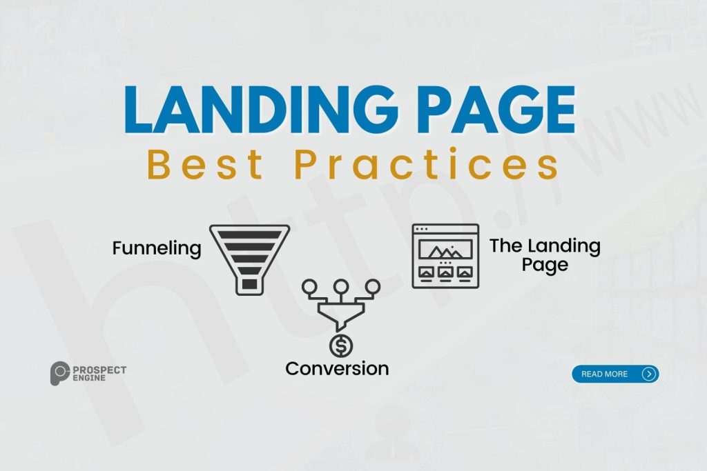
To achieve the best conversion rates for your company’s landing page, following the best practices of a highly focused and targeted strategy is essential. This can be achieved by following the three essential steps below:
1. Funneling
The process of funneling describes how potential customers arrive at the landing page. They are guided through a hyperlink that is integrated into focused marketing material, such as social media posts, email campaigns, Google Ads, or blog articles featured on external websites.
2. The Landing Page
A campaign-oriented web page’s entree, or the main attraction, is its single call-to-action (CTA). Known as a landing page, it is designed to keep the prospective client or customer focused on the CTA without the distraction of other tabs or sections found on a regular website. This is done to reduce extraneous actions and increase the likelihood of conversion.
3. Conversion
The conversion is achieved by the CTA goal set up for prospects, which is the point at which they transition from being potential customers to becoming actual customers. This transition can happen when prospects make a purchase, subscribe to your company’s services, or sign up for a membership.
Are Landing Pages Effective?
To ensure landing pages achieve their full potential in increasing conversion rates, it’s important to follow best practices. Incorporating the following four elements can help you create impactful and successful landing pages for your business.
1. Setting Clear Goals
What’s your CTA (call to action)? This could be anything from encouraging people to subscribe to a newsletter or purchase a product to generating leads through contact forms.
Your goals serve as a guide for designing the concepts, visuals, and layout of your landing page. Think of your goal as the main point of focus that you can refer back to when making decisions about your design, copywriting, and CTA placement.
2. Writing Strong Copy
To create effective copy, it’s important to align with your brand’s core values and messaging and to reflect the goals you’ve set. A solid brand strategy ensures a consistent voice effectively communicates with your customers.
To increase conversions on your landing page, it’s crucial to capture your prospects’ attention and prevent them from navigating away. Engaging, conversational copy with a touch of humor or wit can effectively achieve this goal.
Remember, powerful brand messaging often uses fewer words to make a greater impact.
3. Optimize for Mobile Layout
Half of the landing pages lack mobile-friendly designs, which is a missed opportunity in digital marketing campaigns. With the majority of consumers using their mobile devices, creating mobile-friendly layouts should be a top priority. A visually appealing webpage design may not translate well to mobile, so it’s important to have a clean and simple design that leads prospects to the CTA. Banners, visuals, videos, and forms should all display correctly on mobile devices. Ensure mobile-friendly pages that don’t malfunction on users’ phones.
4. Add Video Content
Including high-quality video content on a landing page can significantly increase conversion rates. Video product demonstrations can generate sales by showcasing the item in action, adding credibility and trust to your company. Hiring talented videographers, video editors, and scriptwriters can help produce high-quality videos that enhance your content. Experimenting with different visual forms and media, including live actors, speakers, and animated content can help create engaging and interactive video marketing content.
What Are The Landing Page Best Practices?
To optimize your landing page design, prioritize key elements above the fold, such as an attention-grabbing headline and CTA. The fold refers to the immediately visible section before users start scrolling. Additionally, ensure that your landing page has a clear and singular purpose, unlike a traditional website, and avoid multiple CTAs, as they can reduce conversion rates. Keep prospects focused on the path leading directly to your main CTA.
How to Get Your Prospects’ Attention
When designing your landing page, keep in mind that the visuals should include directional cues to direct users to the Call-to-Action (CTA) in the optimal location. A skilled designer will create a landing page encouraging users to scroll down for more content.
Bold visuals with contrasting color schemes can be effective design techniques. Longer pages with relevant content are more engaging and can lead to higher conversions.
Maintaining high quality on the backend for fast loading times is essential, as research shows that even a one-second delay decreases conversion rates by 7%. To avoid slowing down your page, follow the principles of minimalist design, using fewer elements and including only essential information, with a focus on interactive content and fill-out forms.
Effective Landing Page Design
Design is crucial for effective landing pages, which should be streamlined and task-focused. Many such pages use a minimalist design, which doesn’t have to be boring to encourage conversions. A good design incorporates layout, structure, color, and imagery to create an engaging user experience (UX), delivering visitors what they seek in a clear and intuitive way.
Structure And Layout
To create an effective landing page, keep the structure simple with a headline, relevant image, lead form, call to action (CTA), and copy. However, the layout is equally important since visitors tend to skim rather than read everything. Make sure your landing page brings important information to the forefront. For example, use a lead form where prospective clients select a service before requesting a consultation.
When designing a webpage, consider these points:
-
- Emphasize key information prominently
-
- Keep information concise
-
- Use whitespace strategically to draw visitors’ attention to specific areas.
Color
To create a sense of familiarity and trust, using colors on your landing page that are consistent with your website and brand is important. Additionally, the strategic use of negative space by incorporating contrasting or neutral colors can help emphasize important information. Experimenting with bold colors on key elements, such as headlines and CTA buttons, can also help draw attention. Ultimately, there’s no single “correct” color scheme, so choose colors that complement your brand and effectively guide visitors through their journey.
Images
Studies have shown that people tend to retain visual information better than text. Therefore, selecting a visually impactful image for your landing page that aligns with your brand and communicates a strong message is crucial. A well-chosen image can significantly influence the overall impression of the page.
Although it may be convenient to use stock photos, a custom image may be more effective for your landing page. When selecting an image, keep in mind that it should:
-
- Reinforce the message of your landing page
-
- Attract your intended audience
-
- Direct visitors toward your call-to-action (CTA)
Landing Page Best Practices for B2B
To optimize your B2B landing pages, consider implementing these key strategies. To ensure that each campaign message is clear and focused, create separate landing pages for each CTA. This approach will help to guide prospects straight to the product or service you want to promote, increasing the likelihood of conversion.
In addition to creating separate landing pages for each CTA, including social proof such as testimonials can help build credibility and make your product or service more appealing. By streamlining the customer journey and showcasing social proof, your landing pages can help drive conversions and increase the effectiveness of your marketing efforts.
In Summary
Creating a powerful landing page doesn’t have to be complex. In fact, it involves straightforward, common-sense methods that many skilled designers, copywriters, and web developers are already familiar with.
By following best practices for landing pages, businesses can ensure that their brand messaging stays focused. Taking the time and resources to develop effective landing pages can result in significant long-term benefits.


